The upbringing of the eNO badge - part 1
We're not just designing for users, but for the people they need protection from too. We're asking them to adopt a new device, a new habit, and a new mindset, all at once. What a beautiful challenge!

Designing for people. And criminals.
With this eNO badge, we’re asking people to adopt a new habit, an extra device, and a safety-oriented mindset in their daily lives. That brings a lot of friction by default since we are asking them to carry around yet another product that also may show signs of vulnerability.
And that is why I see a safety product living in a strange paradox. It must be visibly present to deter, yet invisible to avoid attracting attention. It needs to be aesthetically pleasing and feel desirable to wear, yet make sure users don’t feel exposed or judged wearing it. So success only comes if the product integrates nicely into someone’s life, into how they dress, move, and exist in public spaces… without changing who they are or how they feel about themselves.
In short: We had to invoke peace of mind, confidence, freedom, and empowerment. We had to avoid signaling fear, inconvenience, or awkwardness. Period.
Objectives before aesthetics
Before we even debated colours, shapes, or finishes, we agreed on something far more important: what does the product need to achieve… not aesthetically but symbolically.
Here were our four non-negotiable objectives:
A recognisable product
A practical product
A beautiful product
An empowering product
First, recognisability. We are new. Which means we don’t just have to build a product, we have to teach society who we are and what we stand for. A random design, disconnected from our identity and mission, wouldn’t help us earn trust. And in safety, trust is everything. Recognisability wasn’t about loud branding or visual dominance. It was about coherence. Creating something that, once seen a few times, feels familiar.
Practicality came next. A safety product that adds friction, discomfort, or complexity won’t survive real life. If it interrupts routines or demands attention, it gets abandoned.
Beauty obviously matters a lot… not as fashion, but as reassurance. I think I speak for everyone when I say we associate care, quality, and intention with well-designed objects.
And then came empowerment. We kept coming back to this particular challenge: this product cannot feel imposed. It cannot feel like protection forced upon you. It has to feel chosen, and… empowering.
Only once these objectives were clear did aesthetics enter the conversation.
Love at first sight ~ for the masses
First impressions matter, especially for a product people don’t know and haven’t learned to trust yet. The design needs to get them curious!
You know that feeling when you see someone and you are like: “WOAW!”. Well that is exactly what we were looking for.
Now, attraction and curiosity is the first hurdle to opening the first door, but taste is deeply personal, and designing for individual preference is a losing game. I’ll touch on that more in part 2, but to reach the many, you have to design for what people share in taste, not what divides them … yet another challenge.
Throughout my reading and obsession with pretty things, I came to a simple conclusion: the purer and more restrained a design is, the broader its appeal. Simplicity is what scales.
That’s why we deliberately leaned into a slick, minimal aesthetic. Not to be trendy or to play it safe, but because clean design leaves room for people to project themselves onto the product without dictating identity.
And I’ll admit that simple designs can feel boring… we used to be more attentive to detail in the past… but when done right, simplicity just works.
I see this pattern again and again: products like the Suri toothbrush, Whoop, Supply shaver, Forme bottle shaker, or brands like Apple, Tesla, and Bose all converge on the same truth… To appeal to many, simple beauty needs to be found.
So in a more concrete language, I believe curiosity in a product shouldn’t be triggered by a loud design, it should come from coherence. From a sense that the object belongs, that it was designed thoughtfully, and with purpose.
For us, love at first sight wasn’t about making people want to show the product. It was about making them curious and feel comfortable choosing it.
Challenges we faced
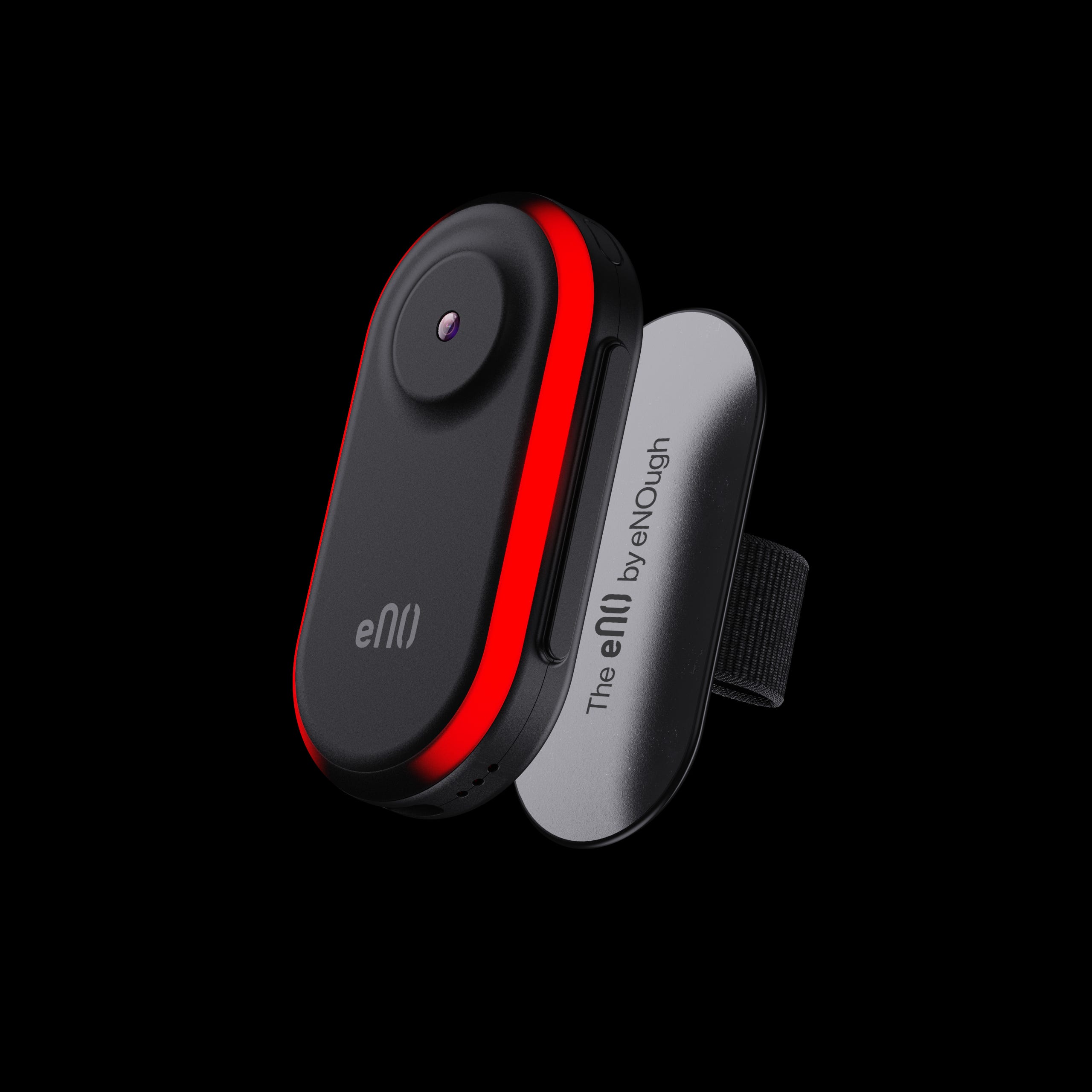
Just in case, some needed context here: the eNO badge is a safety wearable that uses video and audio to analyse the environment for threats and, in case of danger, provide adequate help to its wearer. More here.
To deter criminals from acting, we needed our product to be visible from afar. And after talking to experts, this had to take the form of a red subtle light, invoking protection. This was actually good news! Since I also needed to ensure we indicated ongoing recording in public (yup, we follow the law).
But the real challenge was… how the hell are we going to make these lights pretty. We had to strike the right balance between showing protection, not attracting attention, and not making users feel uncomfortable.
After having drawn a bunch of ugly drawings, an idea clicked. Why not make our badge the shape of our logo and have the red light enclose it. We had something! A single, subtle LED ring, programmable, animated, and integrated as a bridge between the front face and side face of the device, linking both together without adding noise. Its shape echoed our logo, building awareness without forcing it, while remaining part of the design rather than a standalone safety feature. Not to show off, but I’m pretty proud of our pretty clever move there.
The same then applied to the camera. We ensured its position was visible enough to discourage, but discreet enough to avoid a surveillance feel.
More challenges
Once the first drawings became reality, we handed out several 3D-printed mock-ups to users and criminology experts to collect feedback. This was an inevitable step in learning if our users liked our designs. And as predicted, it also opened the door to many more changes.
One of them being that we realised we hadn’t designed our magnetic attachment for users having long nails. Trivial on paper, critical in practice. If removing or adjusting the device risks breaking nails, it introduces additional pain points that demotivate the product usage entirely.
BAMM, we were forced to rethink the attachment mechanism entirely so it could be removed easily without damaging nails. We first increased the grip surface area for easier removal but lost purity in the edges, so we eventually decided to add a soft strap instead to maintain a clean design.
Then came the need for a clip, because how are you meant to put on our badge if you are wearing a tight dress or a bulky jacket.
BOOM, we introduced a clip attachment option.
More and more…
Then there was our choice of gender neutrality. While research consistently shows that women are disproportionately affected by public safety at night, we deliberately chose not to design a “female safety product.” We believe protection should NOT be gendered.
The design had to work for anyone, without reinforcing stereotypes or creating social friction.
This neutrality came with its own challenges. For some users, men in particular, wearing a safety device can feel like a threat to how they’re perceived: strength, control, even masculinity. This is precisely where design matters. Not by denying those perceptions, but by dissolving them. A product that looks discreet, refined, and intentionally worn doesn’t feel like protection… It feels like a personal object.
I will stop here, but these design questions didn’t stop at visual aesthetics.
Vibration feedback when buttons are pressed, sounds emitted, the weight of the device, the texture of the material, how it rests on the body, how it moves as you walk.
And more.
How do you encounter the badge on the website? What’s the first impression when you unbox it? How does that relationship evolve over time? How do you charge it? Where is it stored? How quickly can you activate it in a moment of danger? How do you know the alarm worked?
None of these decisions are simple. Each one shapes the user journey: whether someone is willing to buy it, how safe it makes them feel, whether they trust it, and how often they choose to wear it. This is why we constantly design with human behaviour in mind.
What’s next
This first part focused on the constraints of designing a safety product that people actually want to wear. In Part 2, I’ll cover how we navigated around different tastes and how we stepped back from our own assumptions and listened to people who understand safety from different angles: criminal psychologists, researchers, people working in and around prisons, and users themselves. I’ll also go into how founder taste and user feedback often conflict, why users don’t always know what they want yet, and how we test gut feeling instead of blindly trusting it.